Glassify - Widgets & Themes
- 4.7
- Rating
- 500.00K
- Installs
- Free
- Price

 Analysis by App-foxy
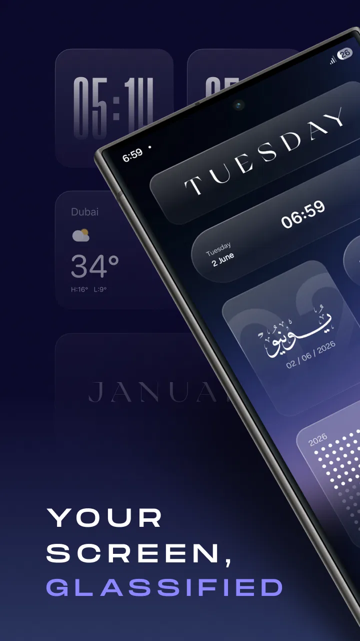
I first noticed Glassify - Widgets & Themes because it treats a home screen as more than a place for app shortcuts. It is a free personalization app from Mahmoud Zadah built around glass-style widgets and detailed control over their appearance. After spending time adjusting layouts and trying to make the widgets fit naturally with the rest of my phone, I came away with a clear impression: this is best for people who enjoy refining small visual details, not for anyone looking for a completely automatic makeover.
The appeal is easy to understand. A glass effect can make a screen feel lighter and more layered, especially when the wallpaper, icons, and widget colors are chosen carefully. The challenge is that this style can also become busy very quickly. My experience with Glassify was less about applying one dramatic theme and more about finding a balance between decoration and daily usefulness. That makes it interesting for a personal phone, but it also raises practical questions when a device is shared at home or used by more than one person.
How Glassify fits into a shared household device
When I consider Glassify on a device several people share, I start with the screen’s everyday job rather than its appearance: which shortcuts need to be easy for everyone to spot? Keeping that purpose in view helps the glass styling support the household routine instead of quietly displacing it. It also makes the next question—how far to customize—much easier to answer.
You May Also Like

 Blood Strike: 2.5 Anniversary
Blood Strike’s Loadouts Turn Every Drop Into a Tactical Gamble
A close look at Blood Strike’s custom loadouts: how fast access to signature weapons reshapes its battle royale rhythm, rewards preparation, and narrows the gap between fights.

 Pandora - Music & Podcasts
Pandora’s Music Is Easy to Start, but Harder to Recover
Pandora’s strength is its low-effort path from a seed to a station. Its weak spot is how much confidence it asks you to place in connection, setup, and quiet recovery.

 8 Ball Pool
 Is Built on Rivalries, Rematches, and Routine
A close look at the rivalries, rematches, shared routines, and unanswered safety questions that turn a quick pool match into a persistent mobile community.

 Samsung Music
’s Quiet Strength Is Playing What You Already Own
Its reach comes less from spectacle than from dependable access to a personal library. That simplicity is both the app’s strongest retention engine and its ceiling.

 AccuWeather: Weather Radar
AccuWeather Review: A Quick, Clear Forecast for Everyday Decisions
For everyday plans, the best forecast is the one you can understand quickly. AccuWeather makes rain timing, radar, and local conditions easy to act on, with a few trade-offs.

 Hill Climb Racing
Why Hill Climb Racing Still Turns Crashes Into One More Run
A tiny car, a bumpy hill and one more upgrade: Hill Climb Racing keeps resurfacing because its simple chaos makes every near-miss feel personal.
More From Our News Desk



A visual change that can help a shared screen feel organized
On a household tablet or a phone that several people occasionally use, appearance is not only a matter of taste. A clear home screen can make it easier to find the apps everyone needs, while a carefully chosen widget can keep everyday information visible without opening several apps. Glassify is useful here when the goal is to make the main screen feel intentional rather than crowded with unrelated shortcuts.
I would use it on a shared device where the household agrees on a calm visual style. A transparent widget placed over a simple wallpaper can create a consistent area for information, while the remaining space stays available for communication, entertainment, or practical tools. The glass look works particularly well when the background has enough contrast. If the wallpaper is already detailed, the translucent appearance may make text and icons harder to separate at a glance.
That is an important difference between a personal phone and a shared one. On my own device, I can accept a design that favors atmosphere over instant readability. On a family tablet, a younger user, a guest, or someone who did not choose the layout may need immediate visual clarity. I would therefore keep the decorative elements around the edges and leave the central area relatively simple.
One realistic evening use case
Imagine a household tablet sitting in the kitchen. One person checks the time, another opens a music app, and someone else uses it to look up a recipe. A glass widget can make the screen look more polished when the tablet is left on a stand, but the design should not compete with the apps people actually need. I would create a restrained first page, place the most frequently used shortcuts where they are easy to recognize, and reserve more experimental styling for a second page.
This approach also avoids a common personalization mistake: designing only for the owner. If a device moves between family members, a striking theme may be attractive to one person and confusing to another. Glassify gives the visual enthusiast room to experiment, but the best shared setup is usually the one that requires the least explanation.
Where the app is less suitable for shared use
Glassify is not the right choice if the household expects every person to have a completely separate visual environment on one device. A personalization tool can change the appearance of the home screen, but that does not automatically create separate account spaces, individual preferences, or private areas. Those boundaries depend on the operating system and the way the device is configured, not on the glass styling itself.
I would also skip it for a device used by someone who prefers familiar, standard controls. The more time spent adjusting transparency, spacing, colors, and widget placement, the more likely it is that the final result will reflect the designer’s taste rather than the needs of every user. For a shared screen, simple built-in widgets may be a better option when reliability and recognition matter more than visual character.
Setting up the look without losing practical boundaries
I would treat readability as a boundary, not a finishing touch. Before committing to a look, I’d check whether the widget remains legible over the chosen wallpaper and whether someone unfamiliar with the setup can still find the usual controls quickly. That simple test helps distinguish useful polish from a design that asks too much of its users.
Start with one widget instead of redesigning everything
The most sensible way to approach Glassify is to begin with a single widget and judge it in normal use. I would place it on the page I open most often, then live with it for a while before adding more. This reveals whether the glass effect remains readable in different lighting and whether it helps the screen or merely fills space.
Starting small is especially useful on a shared device. It gives other users a chance to react before the entire layout changes. If the first widget is easy to understand, a second one can be added with a clear purpose. If it already makes the screen feel too decorative, there is no reason to continue layering effects.
The best customization is the kind that improves recognition, not just appearance. I found that a widget earns its place when I can identify its role immediately. A consistent color treatment can help distinguish one information area from another, but excessive variation makes the screen harder to scan. For household use, I would choose one visual language and apply it sparingly.
Keep the wallpaper and contrast in the same conversation
Glass-style elements depend heavily on what sits behind them. A pale widget over a bright image may lose its boundaries, while a dark translucent panel can appear heavy over a dark background. This is not a flaw unique to Glassify; it is a trade-off built into transparent design. The app gives the style room to shine, but the wallpaper remains part of the result.
My practical tip is to test the layout with both a bright and a dim version of the screen. A design that looks excellent in a preview can become less comfortable when the device is used at night or near a window. For a household device, I would favor stronger separation between text and background over a perfectly seamless glass effect.
This is also where Glassify differs from the usual one-tap theme alternatives. Many standard personalization tools are designed to produce a complete look quickly. Glassify is more hands-on: its value comes from shaping individual elements rather than accepting a finished package. That is rewarding when I want control, but it also means the result depends more on my choices.
Understand the purchase boundary before committing to a full design
The app itself is free, which makes it easy to try without treating the first setup as a financial decision. It also includes optional in-app purchases ranging from a few dollars to the mid-twenties per item. I would explore the free experience first and decide whether the visual workflow is genuinely useful before considering any paid additions.
This matters for a shared household device because one person may be willing to pay for extra customization while the rest of the household may not care about it. I would not build the entire family setup around a style that depends on a purchase nobody else values. A free, readable base layout is the safer foundation, with optional enhancements treated as personal decoration rather than a household requirement.
Version and device compatibility are part of the decision
Glassify is currently at version 1.3.1 and requires Android 11 or later. That makes the operating system requirement important when the app is being considered for an older household phone or tablet. Before planning a shared setup, I would check the device’s Android version rather than assuming that a newer-looking personalization app will work on every spare device in the home.
The requirement also affects how I would choose the target device. If the household has several phones, it may be better to install Glassify on the newer one used for personal customization instead of trying to make an older backup device carry the same design. A consistent look across devices is less valuable than a smooth experience on the device that can actually support the app.
Coordination when several people use the same screen
When several people use the same screen, even small layout changes can disrupt someone else’s habits. I find it helps to agree on which areas should stay predictable before experimenting with the appearance, and to keep optional visual choices away from the shortcuts everyone relies on. With those expectations in place, coordination becomes less about approving every detail and more about protecting a shared routine.
Agree on purpose before agreeing on style
For a shared device, I would ask a simple question before touching the design: what should the home screen help people do? If the answer is quick access to communication and household tools, the widgets should support that purpose. If the device is mainly displayed in a room, visual polish may matter more. Glassify can serve either role, but the layout should be chosen around the answer rather than around the novelty of the glass effect.
This small discussion prevents a familiar problem. One person may add widgets because they look attractive, another may move them to make room for games, and a third may remove them because the screen feels crowded. A shared arrangement lasts longer when everyone understands why each element is there.
Use stable zones instead of constant rearrangement
I recommend dividing the home screen into stable zones. Keep the most important shared apps in one predictable area, place the visual widgets where they do not interfere with those shortcuts, and leave a little empty space rather than filling every gap. This gives each user a mental map of the device.
The non-obvious benefit is that the design becomes easier to maintain. A household device changes over time: apps are installed, shortcuts move, and wallpapers get replaced. If the Glassify elements are concentrated in a defined area, those changes are less likely to disrupt the entire layout. The result feels coordinated without requiring someone to act as the permanent home-screen manager.
I would also take a screenshot of the agreed arrangement before experimenting further. That creates a simple reference point if a family member dislikes a later change. It is not a special Glassify feature; it is a practical habit that makes customization less frustrating when several people have access to the same device.
Separate personal experimentation from the shared default
Glassify is most enjoyable when I can try unusual combinations without worrying about anyone else’s routine. On a shared device, I would keep those experiments on a secondary page or test them on my own phone first. That preserves a dependable default while still allowing the person who enjoys personalization to explore.
This is one reason I see the app as stronger for personal devices than for household ones. A personal phone gives me complete control over the balance between beauty and speed. A shared device requires compromise, and a detailed customization tool can make that compromise more visible. If the household is comfortable with that, Glassify adds character. If not, a standard launcher arrangement may be the wiser choice.
Age, trust, and everyday usability
An Everyone content rating makes Glassify broadly suitable in age terms, but it cannot decide whether a particular design is comfortable for a child, a guest, or an older relative. I would let the least familiar user try the screen and watch for hesitation, especially around text contrast and recognizable controls. That practical check leads naturally to the bigger question of trust: styling can make a device feel personal, but it does not establish privacy or separate access.
Suitable for a broad age range, with adult judgment about the layout
Glassify has an Everyone content rating, so its presentation is intended for a broad audience. That does not mean every possible layout is equally suitable for every user. A child may appreciate colorful or transparent elements, while an older family member may benefit from larger, clearer visual separation. The app’s flexibility can support either direction, but someone should make the final choices with the actual user in mind.
For a child’s shared tablet, I would avoid placing decorative widgets where they could be mistaken for important controls. I would also keep the main page uncluttered and use recognizable app icons alongside any customized elements. The visual style should make the device easier to approach, not turn navigation into a guessing game.
For an older relative, readability would take priority over subtle transparency. A glass effect can look elegant, but low contrast and busy backgrounds may be tiring. In that situation, I would use the app only if the resulting design remains clear at a quick glance. Otherwise, the standard system layout is likely the more considerate option.
Trust is about access boundaries, not just appearance
Personalization can make a device feel more welcoming, but it should not be confused with privacy. A customized home screen does not by itself separate accounts or protect personal conversations, photos, or files from another person who uses the device. If the household needs real privacy, the operating system’s user and account arrangements should be handled first.
This distinction is easy to overlook because a carefully designed screen can feel personal. On my own phone, that feeling is appropriate. On a shared phone, it may create a false sense that each person has a private space. I would explain that Glassify changes the presentation of the device, while access and trust still depend on the device’s broader setup.
When a different personalization option is better
Someone who wants a complete theme with minimal adjustment may prefer the phone’s built-in personalization tools or a conventional launcher with ready-made layouts. Those alternatives are usually easier to hand over to another person because fewer choices need to be explained. They are also better for anyone who values consistency across several devices more than detailed styling on one screen.
Glassify is the better fit when the user specifically enjoys making small visual decisions. The app’s strength is not that it removes all effort; it gives that effort a worthwhile destination. I would recommend it to someone who notices spacing, transparency, color balance, and the relationship between a widget and its wallpaper. I would not recommend it to someone who wants to install a theme once and never adjust it again.
My household verdict after living with the design
Glassify - Widgets & Themes is a focused personalization app with a clear visual identity. Mahmoud Zadah has aimed it at users who want more control over individual glass-style widgets than a basic theme switch normally provides. With a 4.7 average from around two thousand ratings and over one hundred thousand installs, it has attracted a meaningful audience, but those figures are only part of the decision. The real question is whether its hands-on approach matches the way you use your phone.
I like it most on a personal Android device where I can adjust the screen around my own habits. The free entry point makes experimentation approachable, and the glass effect can look genuinely refined when the wallpaper and contrast are chosen with care. The strongest results come from restraint: one or two useful widgets, a background that does not fight them, and enough empty space for the screen to breathe.
For a household device, my recommendation is more cautious. It can work well when everyone agrees on a simple layout and understands that the styling does not create separate accounts or privacy boundaries. I would establish the shared app arrangement first, then add Glassify elements around it. That order keeps decoration from taking control of the device’s practical purpose.
The app is free to download, carries an Everyone age rating, and works on Android 11 or later, while optional purchases are available for users who want to spend more on customization. I would begin with the free setup, test it in daylight and at night, and let the least enthusiastic household user try it before making the design permanent.
My final view is positive, with a clear condition: Glassify is worth choosing when you want to design your screen, not merely decorate it. For a personal phone, that can be an enjoyable and surprisingly effective way to make daily interactions feel more deliberate. For a shared device, it succeeds only when clarity, agreement, and account boundaries come before visual flair. If that sounds like the right balance, this app gives you enough room to create a distinctive home screen without forcing you into a complete, all-or-nothing theme.
FAQs for Glassify - Widgets & Themes
01What is Glassify - Widgets & Themes?
Glassify is a customizable app that allows users to personalize their Android or iOS devices with a variety of widgets and themes. It offers a sleek, glass-like aesthetic, providing a modern and stylish look to your home screen. The app includes a range of options to fit different styles and preferences.
02How do I customize widgets and themes in Glassify?
Customizing widgets and themes in Glassify is simple. Once you open the app, you can browse through different categories of widgets and themes. Select your preferred style, and follow the on-screen instructions to apply it. You can also adjust colors, sizes, and other elements to perfectly match your device's look.
03Is Glassify free to use, or does it have any in-app purchases?
Glassify offers both free and premium features. While you can access a basic selection of widgets and themes for free, there are additional premium options available through in-app purchases. These may include exclusive themes, advanced customization tools, and ad-free usage for a more seamless experience.
04Does Glassify affect my device's performance or battery life?
Glassify is designed to be efficient, but like any app that runs continuously, it may have a slight impact on battery life. The app is optimized to minimize resource usage, ensuring smooth performance. However, extensive use of live widgets or themes with animations may consume more battery.
05Can I use Glassify on both Android and iOS devices?
Yes, Glassify is available for both Android and iOS platforms. The app is designed to provide a consistent experience across different devices, though some features might vary slightly depending on the operating system. Ensure your device meets the app's system requirements for optimal performance.
Pros
- Highly customizable widget options.
- Easy-to-use interface for beginners.
- Wide variety of themes available.
- Regular updates with new features.
- Seamless integration with devices.
Cons
- Limited free version customization.
- Ads can be intrusive at times.
- Some themes require in-app purchases.
- Occasional lag on older devices.
- Limited support for third-party apps.

Glassify - Widgets & Themes
Gallery